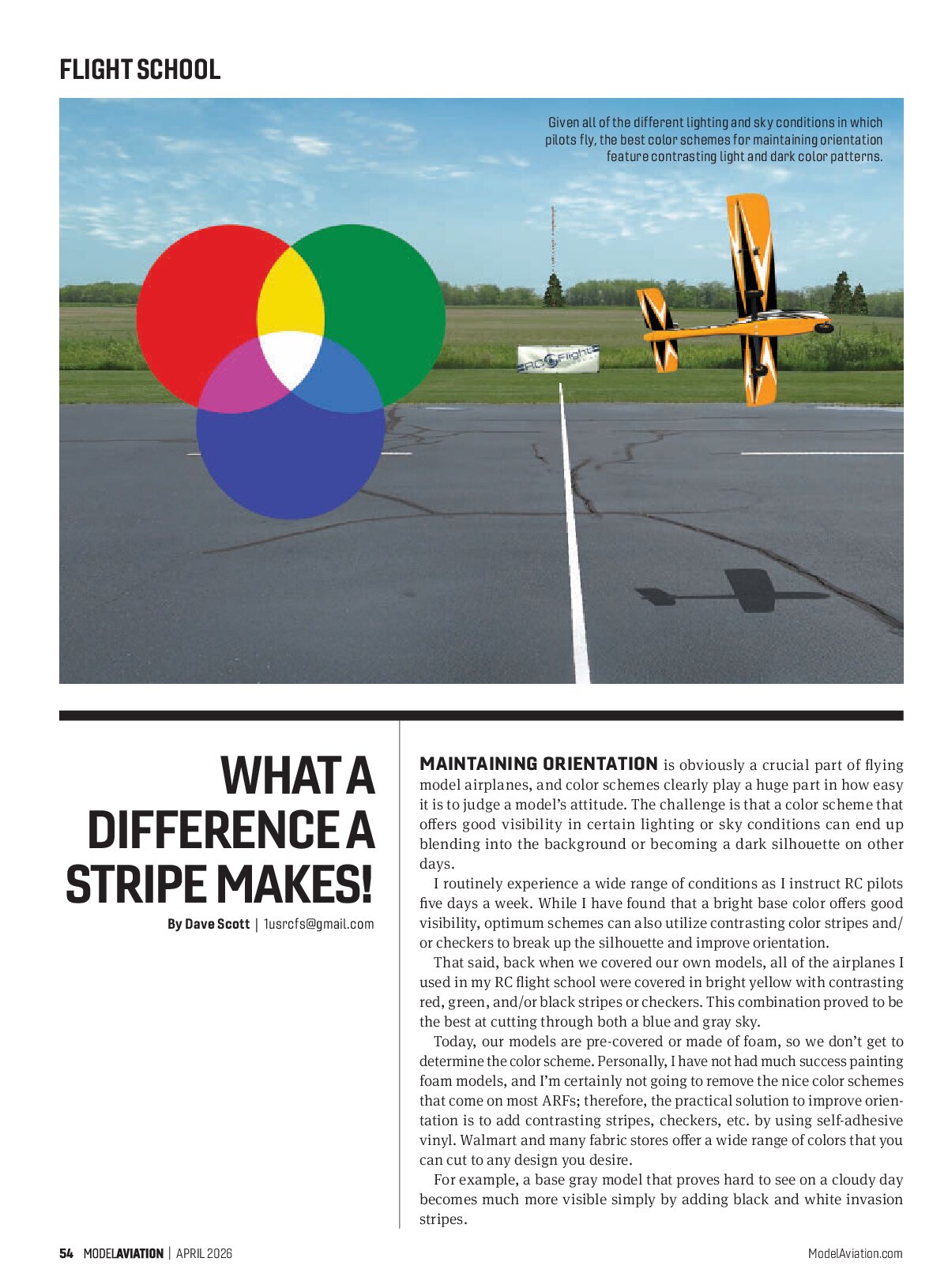
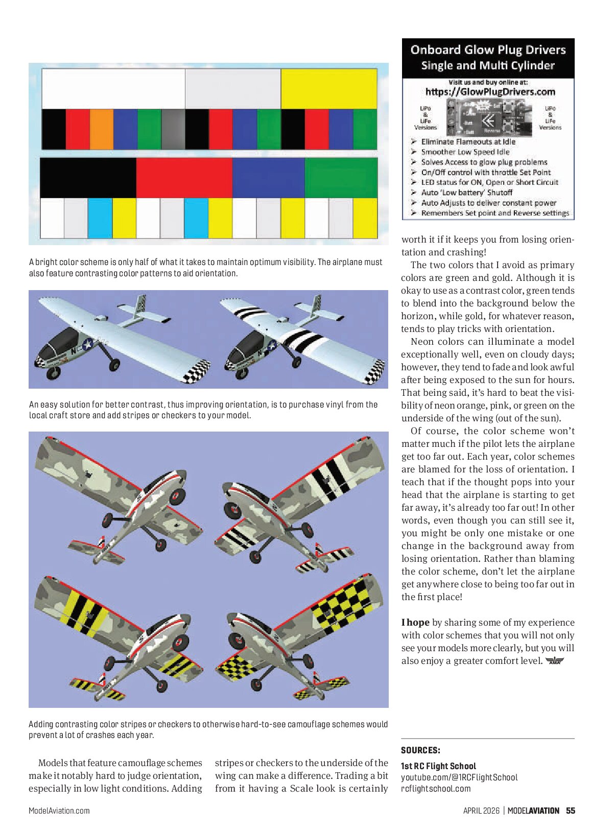
Given all of the different lighting and sky conditions in which pilots fly, the best color schemes for maintaining orientation feature contrasting light and dark color patterns.
What a Difference a Stripe Makes!
By Dave Scott | 1usrcfs@gmail.com
Maintaining orientation is obviously a crucial part of flying model airplanes, and color schemes clearly play a huge part in how easy it is to judge a model’s attitude. The challenge is that a color scheme that offers good visibility in certain lighting or sky conditions can end up blending into the background or becoming a dark silhouette on other days.
I routinely experience a wide range of conditions as I instruct RC pilots five days a week. While I have found that a bright base color offers good visibility, optimum schemes can also utilize contrasting color stripes and/or checkers to break up the silhouette and improve orientation.
That said, back when we covered our own models, all of the airplanes I used in my RC flight school were covered in bright yellow with contrasting red, green, and/or black stripes or checkers. This combination proved to be the best at cutting through both a blue and gray sky.
Today, our models are pre-covered or made of foam, so we don’t get to determine the color scheme. Personally, I have not had much success painting foam models, and I’m certainly not going to remove the nice color schemes that come on most ARFs; therefore, the practical solution to improve orientation is to add contrasting stripes, checkers, etc. by using self-adhesive vinyl. Walmart and many fabric stores offer a wide range of colors that you can cut to any design you desire.
For example, a base gray model that proves hard to see on a cloudy day becomes much more visible simply by adding black and white invasion stripes.
Models that feature camouflage schemes make it notably hard to judge orientation, especially in low light conditions. Adding stripes or checkers to the underside of the wing can make a difference. Trading a bit from it having a Scale look is certainly worth it if it keeps you from losing orientation and crashing!
The two colors that I avoid as primary colors are green and gold. Although it is okay to use as a contrast color, green tends to blend into the background below the horizon, while gold, for whatever reason, tends to play tricks with orientation.
Neon colors can illuminate a model exceptionally well, even on cloudy days; however, they tend to fade and look awful after being exposed to the sun for hours. That being said, it’s hard to beat the visibility of neon orange, pink, or green on the underside of the wing (out of the sun).
Of course, the color scheme won’t matter much if the pilot lets the airplane get too far out. Each year, color schemes are blamed for the loss of orientation. I teach that if the thought pops into your head that the airplane is starting to get far away, it’s already too far out! In other words, even though you can still see it, you might be only one mistake or one change in the background away from losing orientation. Rather than blaming the color scheme, don’t let the airplane get anywhere close to being too far out in the first place!
I hope by sharing some of my experience with color schemes that you will not only see your models more clearly, but you will also enjoy a greater comfort level.


SOURCES
- 1st RC Flight School
youtube.com/@1RCFlightSchool - rcflightschool.com