AERIAL PHOTOGRAPHY: FUNDAMENTALS OF COMPOSITION
By Patrick Sherman | lucidity@oswellflightcrew.com

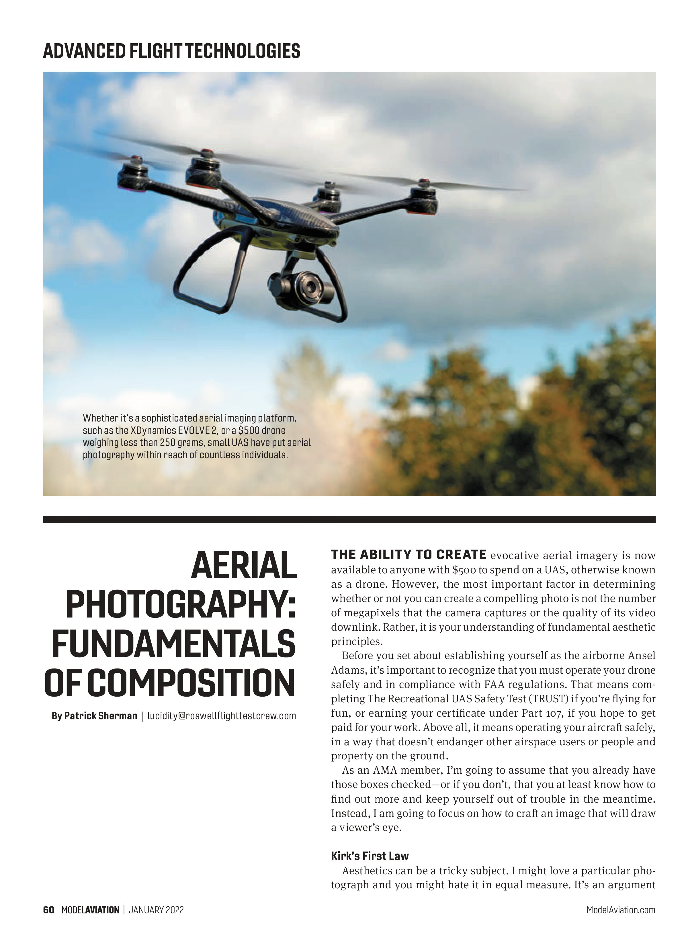
THE ABILITY TO CREATE evocative aerial imagery is now available to anyone with $500 to spend on a UAS, otherwise known as a drone. However, the most important factor in determining whether or not you can create a compelling photo is not the number of megapixels that the camera captures or the quality of its video downlink. Rather, it is your understanding of fundamental aesthetic principles.
Before you set about establishing yourself as the airborne Ansel Adams, it’s important to recognize that you must operate your drone safely and in compliance with FAA regulations. That means completing The Recreational UAS Safety Test (TRUST) if you’re flying for fun, or earning your certificate under Part 107, if you hope to get paid for your work. Above all, it means operating your aircraft safely, in a way that doesn’t endanger other airspace users or people and property on the ground.
As an AMA member, I’m going to assume that you already have those boxes checked—or if you don’t, that you at least know how to find out more and keep yourself out of trouble in the meantime. Instead, I am going to focus on how to craft an image that will draw a viewer’s eye.
Kirk’s First Law
Aesthetics can be a tricky subject. I might love a particular photograph and you might hate it in equal measure. It’s an argument that neither of us can win because, in the words of noted art critic James T. Kirk, “There is no accounting for taste.”
Many people who have made good livings creating visual art throughout the centuries and right up to today believe that there are some fundamental principles that that can guide us to create intrinsically appealing images.
Of course, there are many distinct elements that contribute to the quality of a photograph: composition, lighting, exposure, focus, color, and texture. As you might have guessed, I am not going to cover all of them in a three-page article. Instead, I will focus exclusively on composition, which is a fancy way of saying how objects are organized within the frame of your photo.

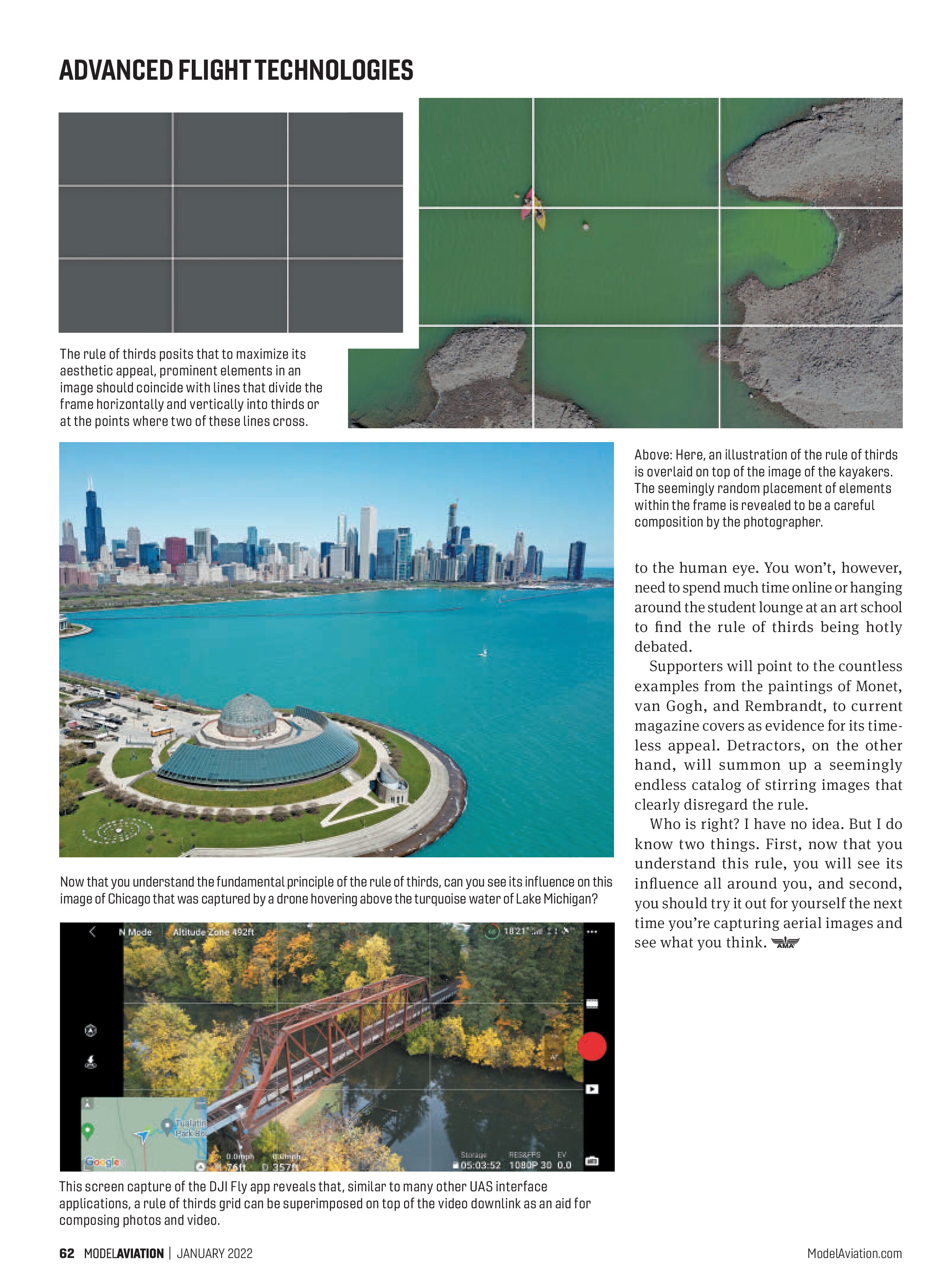
A fundamental principle of composition in photography, painting, cinema, and graphic design is “the rule of thirds,” which offers guidance on where to place prominent elements within an image. The basic idea is to draw imaginary lines across the image, dividing it into thirds both horizontally and vertically. With this done, your frame will look something like a game of tic-tac-toe before the first “X” or “O” is drawn.
To compose an image that honors the rule of thirds, you should seek to align important features within the frame with one of those lines, or at one of the four points where two of them intersect. This rule was first written down by English artist John Thomas Smith in 1797 and is, itself, essentially a simplification of the “golden ratio” that was established by Pythagoras in ancient Greece.
Is It Art?
The idea is that images that reflect the rule of thirds will be intrinsically pleasing


to the human eye. You won’t, however, need to spend much time online or hanging around the student lounge at an art school to find the rule of thirds being hotly debated.
Supporters will point to the countless examples from the paintings of Monet, van Gogh, and Rembrandt, to current magazine covers as evidence for its timeless appeal. Detractors, on the other hand, will summon up a seemingly endless catalog of stirring images that clearly disregard the rule.
Who is right? I have no idea. But I do know two things. First, now that you understand this rule, you will see its influence all around you, and second, you should try it out for yourself the next time you’re capturing aerial images and see what you think.